Brand assets
Logo and images to download
Everything on this page can be downloaded and used freely when you write about us or work with us. The files have stable addresses, so a link from here still works next year.
The avatar carries the mark on its own, without the name: the name sits beside the avatar everywhere on LinkedIn anyway, and written out inside the square field it becomes unreadable long before the avatar reaches the 48 pixels it is shown at. The banner carries no logo, because the avatar sits on top of its left-hand portion.
300 × 300 px
The company avatar on LinkedIn. The mark on its own - the name sits beside the avatar everywhere it appears.
Download PNG
1128 × 191 px
The company banner on LinkedIn. The content sits to the right of the profile picture, which overlaps the lower left corner.
Download PNG
2256 × 382 px Upload this one
The same banner at double resolution. Upload this one - the LinkedIn uploader rejects 1128 × 191, which sits exactly on their stated minimum.
Download JPG
There are two banners here because the LinkedIn uploader rejects 1128 × 191 - it sits exactly on their stated minimum. Upload 2256 × 382; it is the same banner at double resolution, and sharper on high-density screens. The documented size stays here for the day the uploader is fixed.
Banner for other uses
The same banner, but with the logo on it. It belongs where no avatar sits on top - an email header, the opening slide of a presentation, an event image. Do not upload it to LinkedIn: there the logo gets covered.
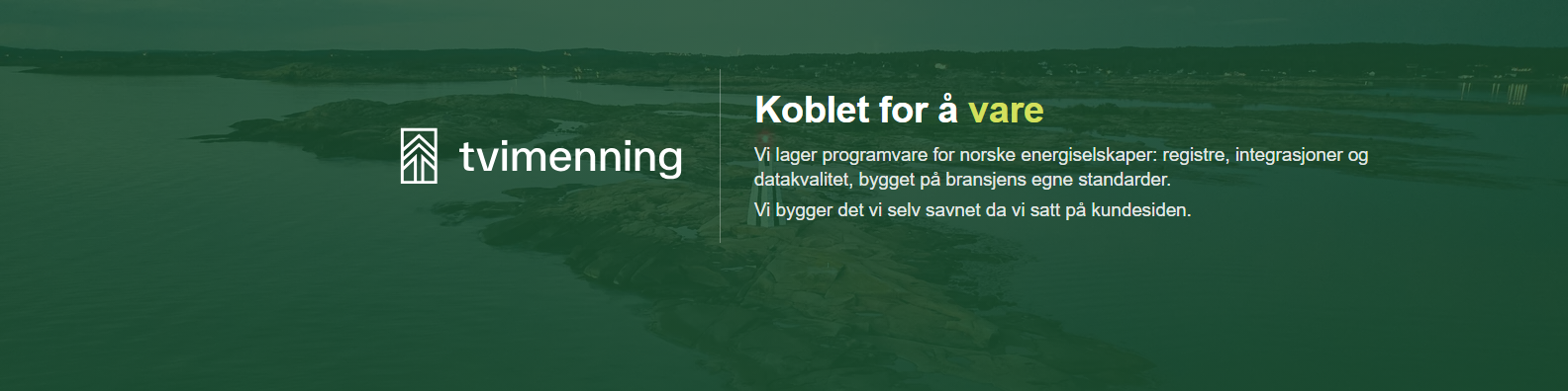
1584 × 396 px
Cover image for your own LinkedIn profile. The lockup is visible here, unlike on the company banner - on a personal profile the avatar is a face, so without it the surface has no sender.
Download PNG
1128 × 191 px
The banner with the logo lockup, for use outside the LinkedIn company page - email headers, presentations, events. Do not upload this one to LinkedIn: there the profile picture covers the lockup.
Download PNG
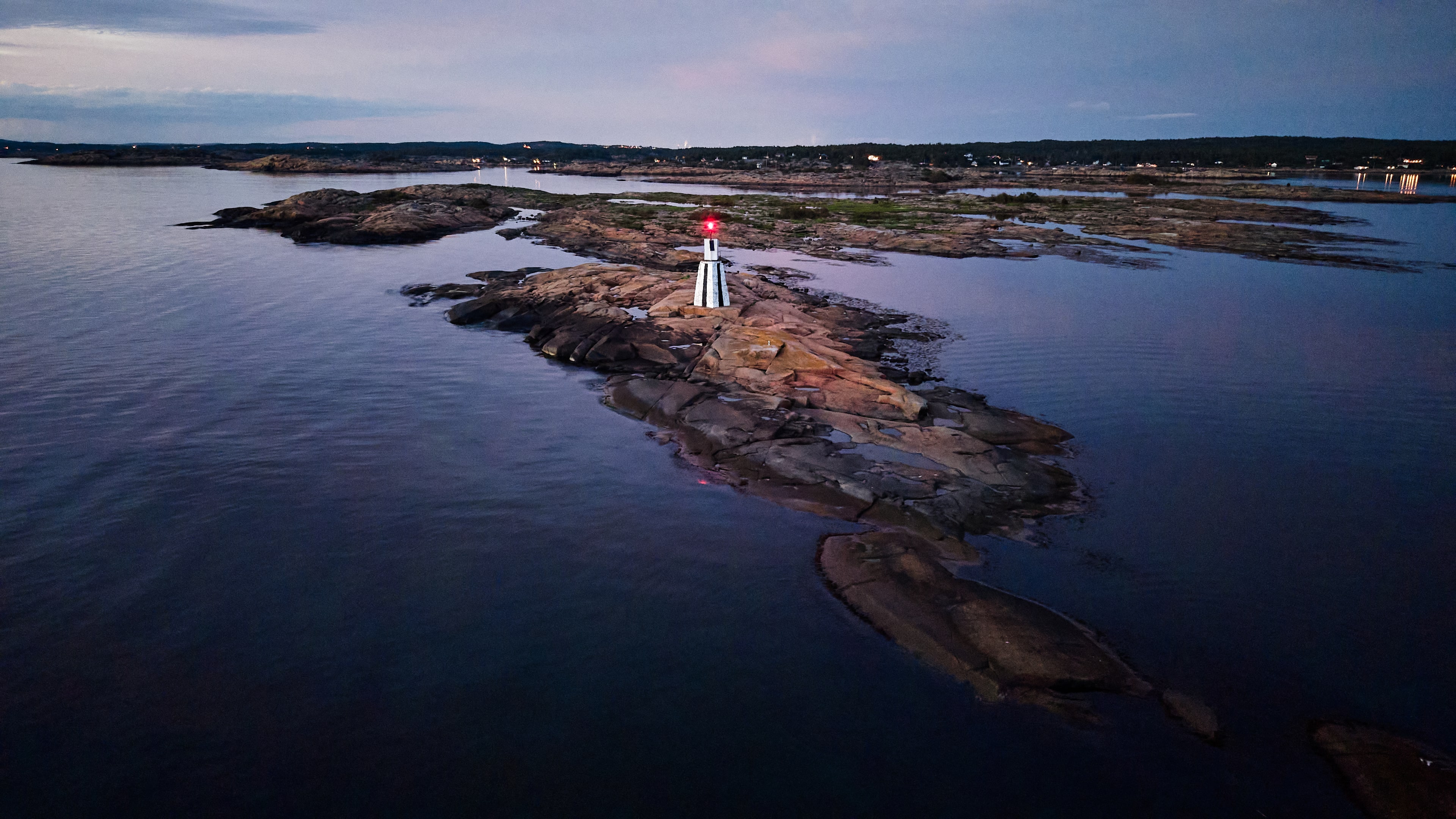
Desktop wallpaper
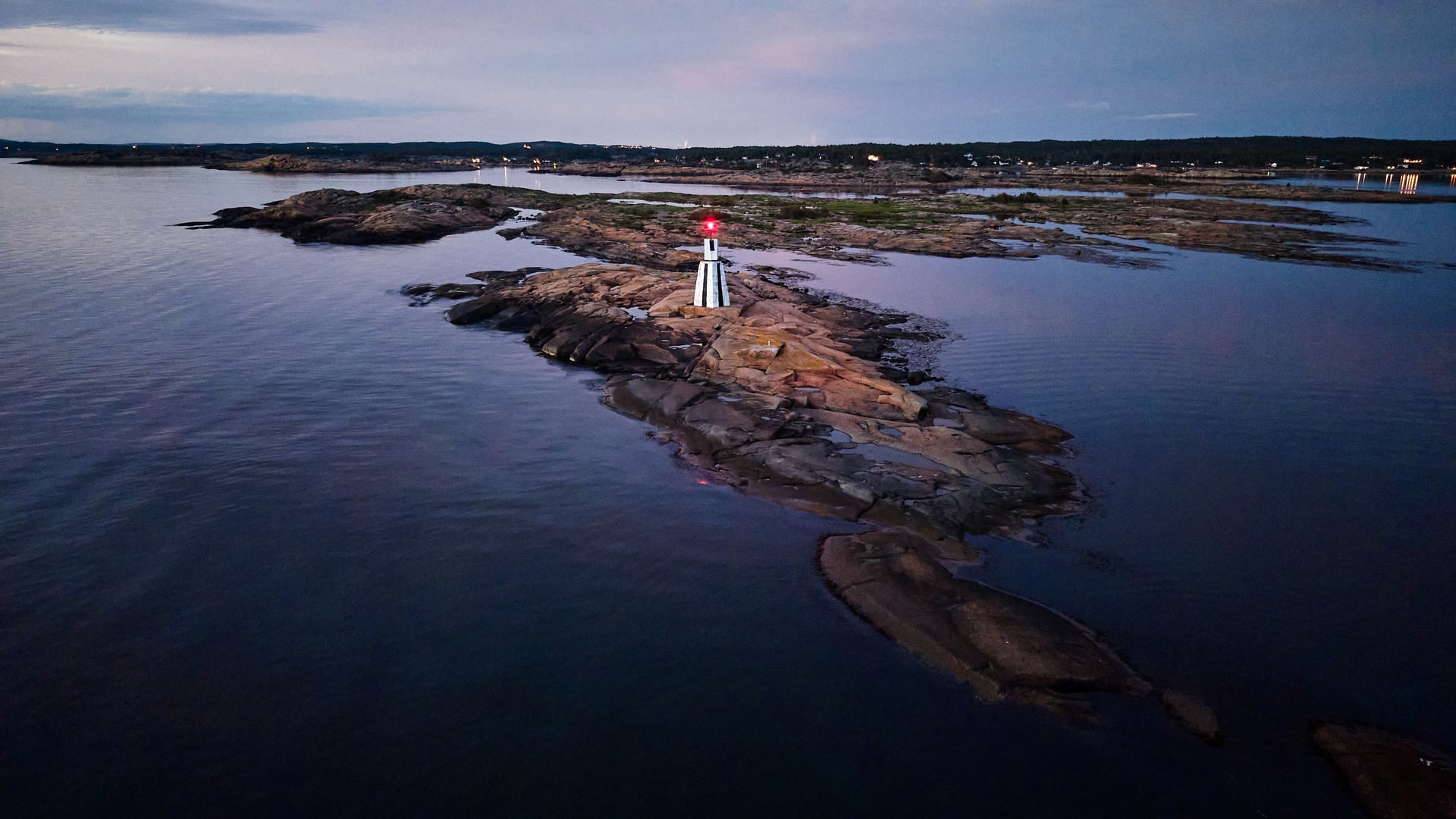
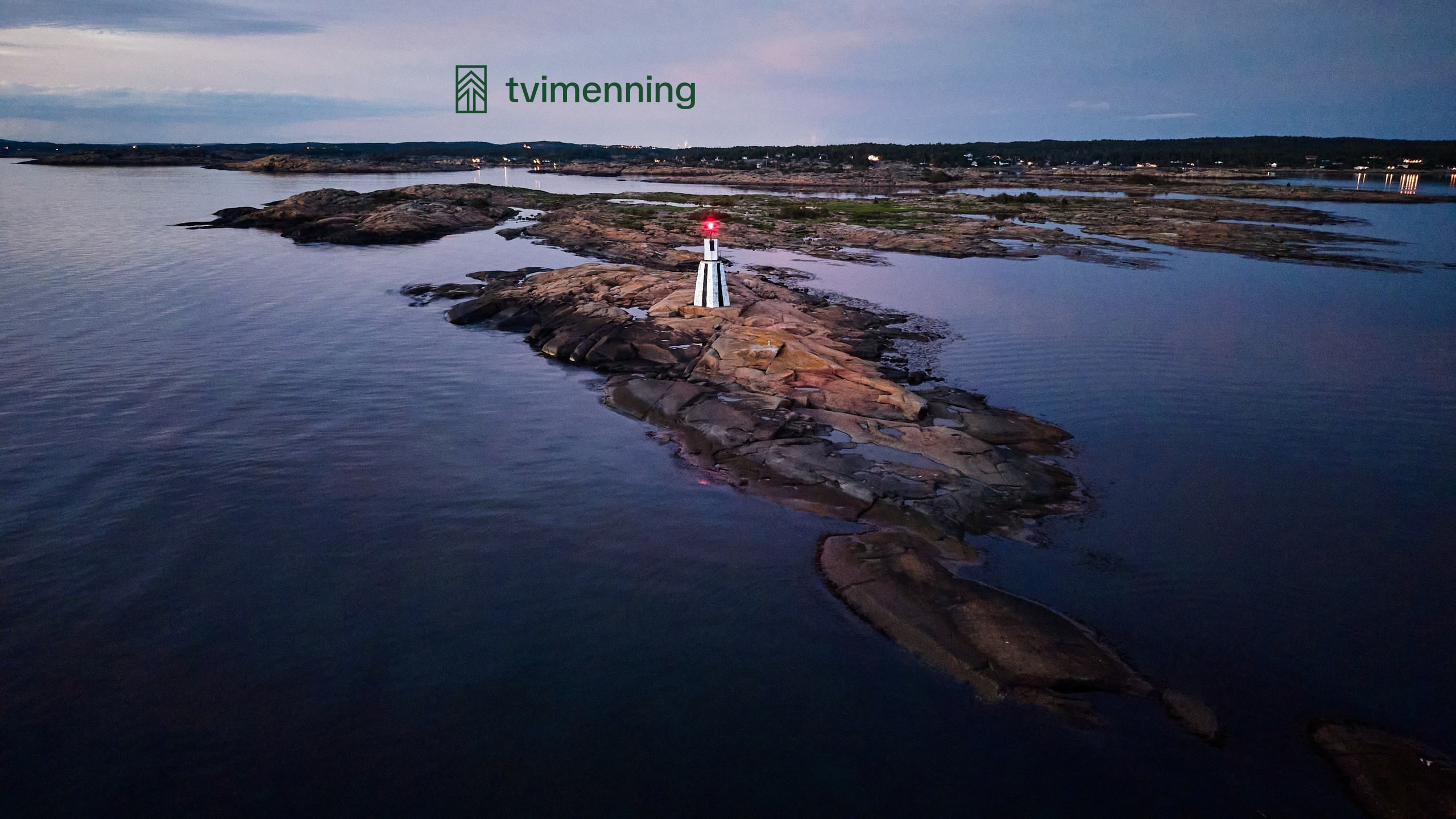
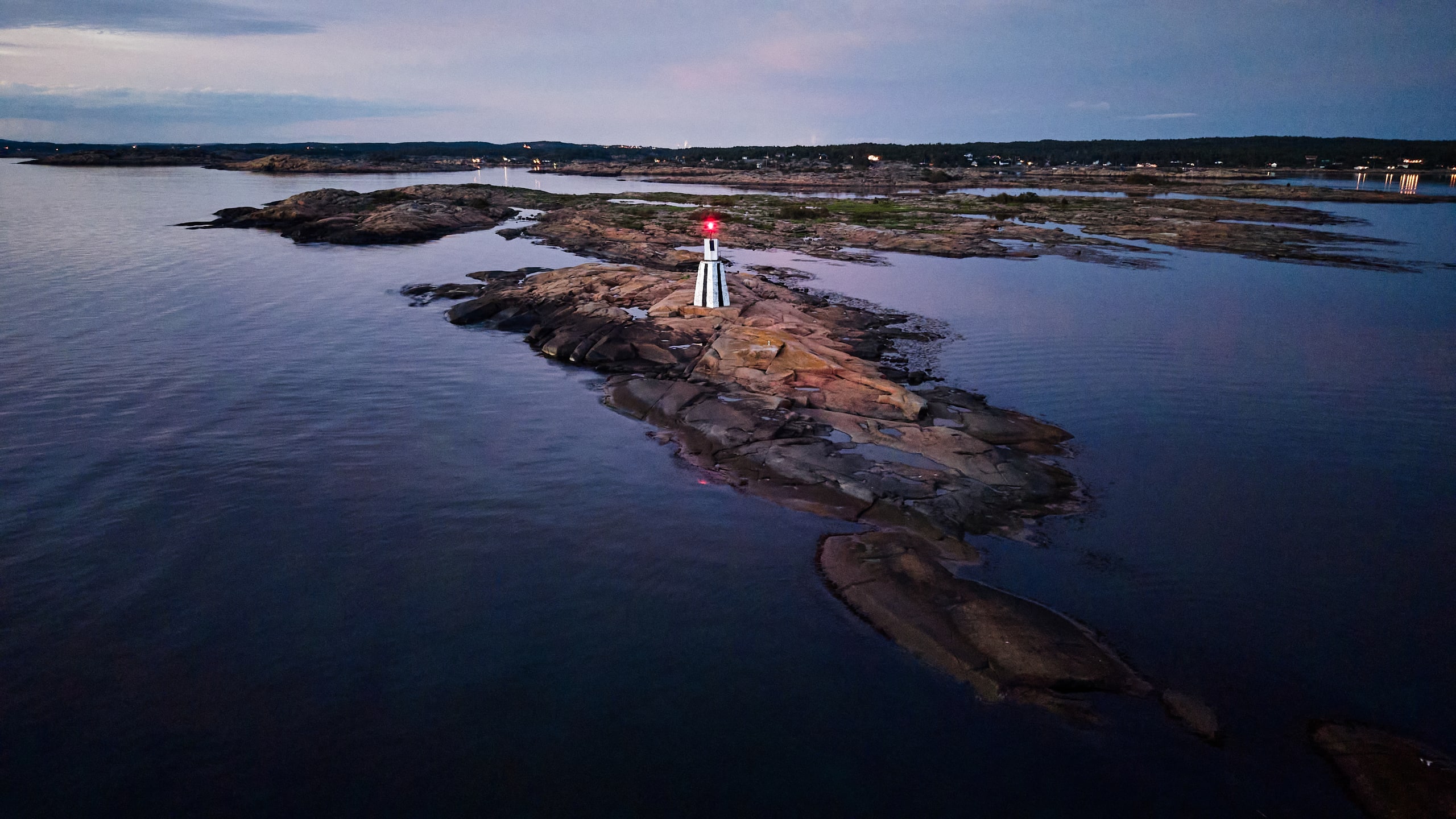
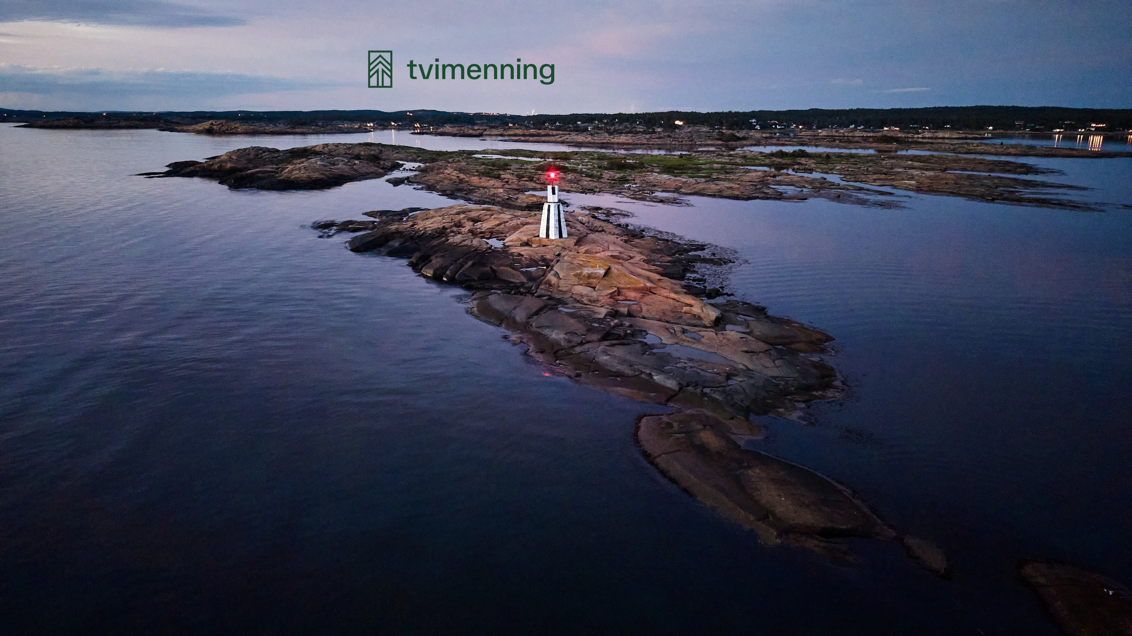
The same photograph in three screen sizes, with and without the logo. Pick the size that matches your screen - a 4K file on a standard laptop is four times larger than it needs to be.
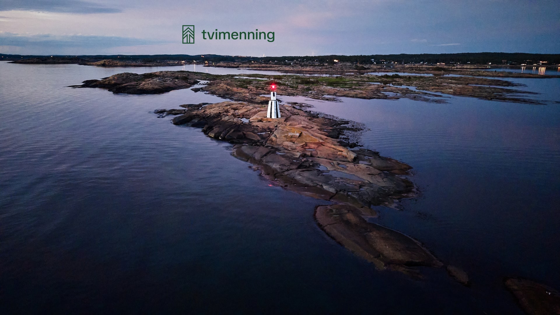
A lighthouse on a skerry at dusk. Photo: Richard J. Thomas.
1920 × 1080
A standard laptop screen.
2560 × 1440
Most office monitors.
3840 × 2160
A 4K display.
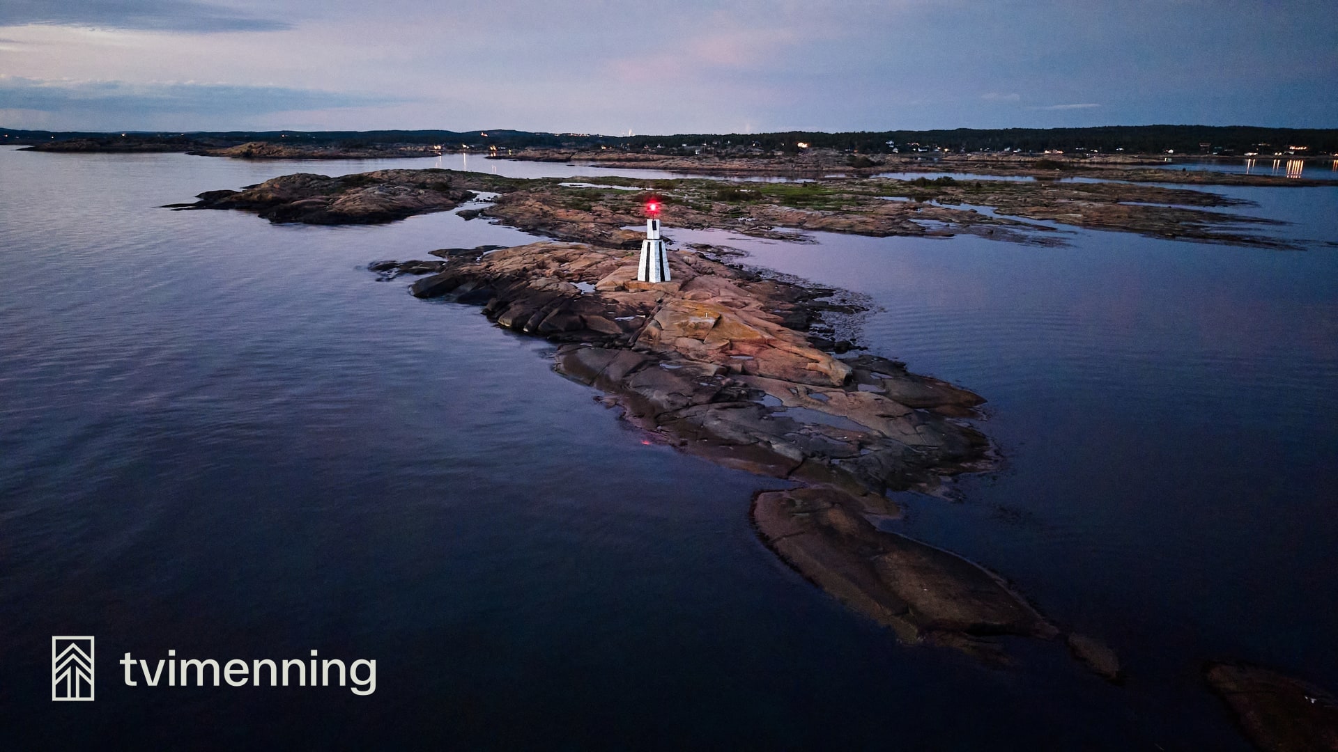
Meeting background
For Teams and Google Meet. The same photograph as the wallpaper, but the logo sits out at the edge - the middle is where you are. Note that both services mirror your self-view, so the logo looks reversed to you and correct to everyone else.
1920 × 1080
Teams and Google Meet
Post images
Square images for LinkedIn posts. A claim in two steps with one highlighted word in each, and a question at the bottom. The colour says what the post is about: copper for the industry, green for something that is ours.
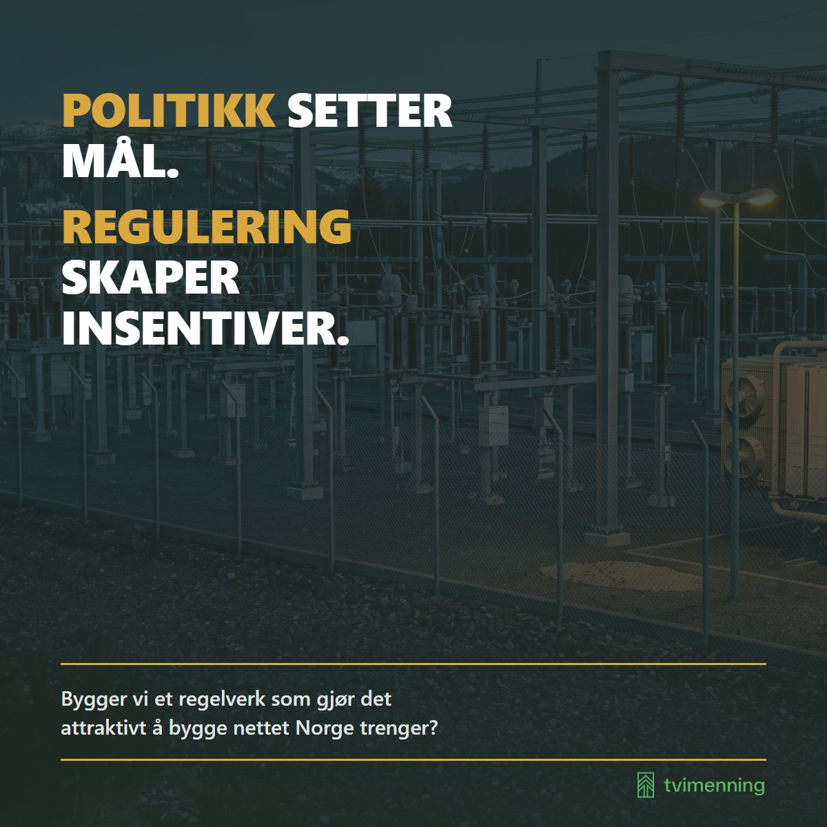
1200 × 1200 px Kobber
Bygger vi et regelverk som gjør det attraktivt å bygge nettet Norge trenger?
Download JPG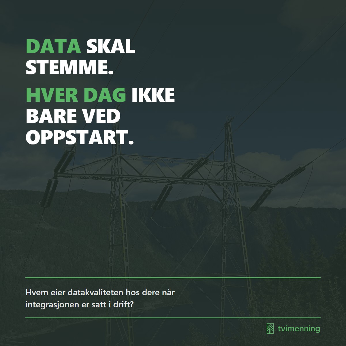
1200 × 1200 px Grønn
Hvem eier datakvaliteten hos dere når integrasjonen er satt i drift?
Download JPG
The logo files
All in SVG, which scales to any size without going blurry. If you need a raster version, ask for it rather than exporting one yourself - that way you get the right crop and the right background.

Helhvit
On a dark background where the green mark does not reach 3:1 - over a photograph, for instance.
Download SVG
Merket alene
Only where the name already appears beside it: avatars, favicons, app icons. The green mark on a light background is for large surfaces. An avatar at 48 pixels needs darker ink.
Download SVG
Helsvart
Where the print has only one colour: mugs, embroidery, engraving, stamps. No gradient, no thin strokes, same geometry as the all-white version. Ask for the vector file, not a screenshot of it.
Download SVG
Merket alene, svart
The mark alone in a single colour, for the same surfaces as the all-black lockup: an embroidered chest, an engraved pen, a stamp. Use it where the name already appears beside it and the print takes only one colour.
Download SVG
Link sharing
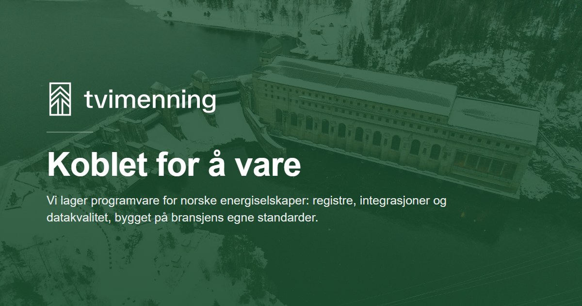
The preview that accompanies a pasted link to tvimenning.no. Most chat and posting tools show it, not just LinkedIn.
1200 × 630 px
The preview that appears when someone pastes a link to tvimenning.no into a chat or a post.
Download JPG
The rules
Four, and they are short on purpose.
Scale proportionally
Never stretch it. The mark is two T-runes with measured geometry - the arm angle is 41.90°, and a stretched rune has the wrong angle and stops being that symbol.
The mark beside the name
Never stacked above it. A mark placed above the name reads as a miniature left over, with air beneath it before the name arrives. Beside it, it carries.
Contrast at least 3:1
Against the background the mark actually sits on. The green mark measures 3.83:1 against the house dark green, but only 1.88:1 against the light sage - pick another variant then, rather than hoping.
No plate behind the logo
If the logo sits over a photograph, pick the variant that holds against the image. If it still needs help, use a soft gradient that fades out - never an opaque rectangle with a visible edge.
The typeface
TASA Orbiter is the only typeface in the brand, in weights 400, 500 and 600. Headings are set in Regular 400, not Medium: the face is wide and geometric, and Regular already carries enough at heading sizes. Medium is reserved for pull-quotes and navigation, Semibold for small type with a job - eyebrow, label, pill, button, statistic. The typeface is released under the SIL Open Font License and can be downloaded freely. No serif on web surfaces.
- Tvimenning
400 RegularBrødtekst og alle overskrifter - Tvimenning
500 MediumIngresssitat og navigasjon, ingenting annet - Tvimenning
600 SemiboldLiten tekst med en jobb: eyebrow, etikett, pille, knapp, tall
The colours
Twenty values in five families, four tones each, plus the accent that is derived because the palette had a hole. The values are exact: a deviation of one or two digits counts as wrong, because the near-misses are the errors that survive review. The right-hand column says which foreground the colour takes when used as a fill. Do not reason your way to it - look it up. The tone number does not predict the answer: blue-500 takes Ink while rust-500 takes Paper.
- green-50
#E5F9E2Surface. Band carrying master-brand emphasis. Takes Ink. - green-200
#B6EDABLight green fill. Takes Ink. - green-500
#68B558SPIRA. A fill, never text. Takes Ink - Paper measures 2.2:1 and is unreadable. - green-900
#233120Ink. All default text. Also FRAMSYN. Takes Paper. - rust-50
#FBEAE0Light rust tint. Takes Ink. - rust-200
#EDA87ALight rust. Takes Ink. - rust-500
#94412FSTUBB. Looks mid-toned but takes PAPER. Ink measures 2.0:1. - rust-900
#3B0014RUNA. Takes Paper. - blue-50
#DBF1FFLight blue tint. Takes Ink. - blue-200
#A1DBFFLEIDANG. Takes Ink. - blue-500
#28AAEALEIDAR. Takes Ink. - blue-900
#0A3344SAMTYGD. Takes Paper. - neutral-50
#F1EFEAPaper. Text and logo on a dark fill. This is what «white» means in this brand. - neutral-200
#DCDED3HANDSAL. Takes Ink. - neutral-500
#808277Dead zone. Large text from 24px and graphics only. Carries body text in no foreground. - neutral-900
#32332FInk, secondary. Body copy under a heading, captions. Also VIT. - lime-50
#F7F9E1Page. The default background of a full page. Takes Ink. - lime-200
#D3E05DSEFTA. Takes Ink. - lime-500
#919622Dead zone, and the more dangerous of the two: 4.3 against a 4.5 threshold passes every eyeball test and fails the check. - lime-900
#3F3F0ADark lime. Takes Paper. - green-600
#3F7935Accent. Green TEXT on a light surface: eyebrows, role labels, small emphasis. Derived, not in the palette. - Surface
#FFFFFFThe surface of a card sitting on Page. The only permitted value outside the palette, and only here. - Kobber
#BC8F2AUnder review. Not in the palette. Used today as a fill with dark text on it; as an accent colour it loses against lime.