Definition
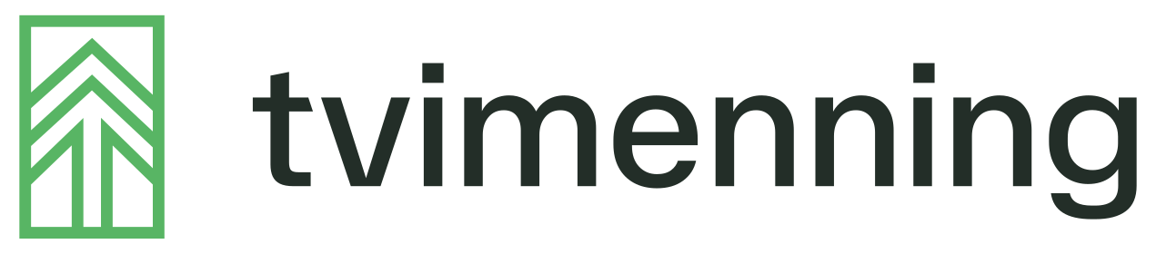
The mark has four layers, and each of them answers something.
The tree. The spruce at the centre stands for renewable energyEnergy from sources that renew naturally - wind, solar, hydropower and bioenergy - as opposed to fossil fuels., nature and growth that lasts. The energy sector is about managing the forces of nature, and the tree anchors the mark in that reality.
The lift. The lines do not point upward like a theoretical arrow. They are two pairs of forces going underneath and lifting together - we take on heavy work and lift it alongside the customer, not instead of the customer.
The two runesThe Norse alphabet - the oldest Germanic script, used by Norse peoples from around 200 AD through the Viking age and into the Middle Ages.. The mark is built from two T-runes, for TvimenningOld Norse meaning 'two bound together' - one who solves a task shoulder to shoulder with another., on the same stem. The TiwazThe rune ᛏ - seventeenth in the Elder Futhark and the one that names Týr's aett. Called after Týr, the Norse god of law, assembly and the sworn oath. Tvimenning's logo is built from this rune. rune (ᛏ) stands for justice, reliability and keeping one's word. Two of them together is double strength and a partnership that does not shift - precisely what the name means.
The frame. The rectangular frame draws a boundary, and shows just as clearly what we do not do. It gives us the right to say no. What falls outside it we would rather connect with others.
The form is deliberately precise and geometric. The infrastructure we work against lasts 50 to 200 years, and the mark should be able to stand there just as long.