Visual identity

Two runes, one lift

Tvimenning is an old word for two people working together. The logo is the same idea drawn as a shape: a tree, an upward motion, and two runes sharing a single stem.

Tvimenning logo
Two can achieve what one cannot alone - you get double the joy and half the worry.

The thinking behind the logo

Four layers in one shape

01

The tree

The spruce at the centre represents renewable energy, nature and sustainable growth - the core of everything Tvimenning builds. It is not an arbitrary symbol: the energy sector we work in is about managing the forces of nature, and the tree anchors the mark in that reality.

02

Lifting together

The lines in the logoTvimenning's mark - two Tiwaz runes on the same stem, together forming a tree, inside a frame. do not simply point upward like a theoretical arrow - they represent two pairs of forces going underneath and lifting together. This is the visual translation of Tvimenning's role as a workhorse: we take on heavy, complex tasks and lift them together with the customer, not instead of them.

03

The two Tiwaz runes

The Tvimenning mark, built from two Tiwaz runes stacked on a shared stem
The mark in full

The symbol is built from two T-runes - for Tvimenning - stacked on top of each other, sharing the same stem. In Norse mythology, the Tiwaz runeThe rune ᛏ - seventeenth in the Elder Futhark and the one that names Týr's aett. Called after Týr, the Norse god of law, assembly and the sworn oath. Tvimenning's logo is built from this rune. (ᛏ) stands for justice, reliabilityTrust - one of Tvimenning's core values and foundation for long-term customer relationships in the energy sector. and keeping one's word. Two runes together capture the idea of double strength and an unshakeable partnership: exactly what our name means.

04

The frame

The rectangular frame sets a clear boundary. It shows exactly what we take responsibility for - and just as important, what we don't. That gives us the right to say no. What we deliver inside the frame, we deliver with uncompromising quality. What falls outside, we connect with other ambitious partners instead.

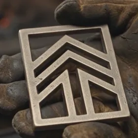
The Tvimenning mark cast in metal, held in a work glove

The workhorse, not the race car

Stone and metal, not plastic

Tvimenning is a Toyota Hilux, not a Ferrari. We are not chasing quick wins or dreaming of global dominance - we build for utilities in the district and the city, in Norway, Sweden and Denmark, that need to stay in operation for a long time.

The physical infrastructure we build for lasts 50 to 200 years. Our IT solutions are modular precisely because of this: you should be able to swap out the pieces along the way without tearing down the core. The logo is built on the same principle - precise and geometric, so it can stand just as long.
Connected to last

The tagline works on three levels: the name - people working together, the method - systems connected seamlessly, and the intent - solutions built to stand the test of time. The logo is the visual proof of all three.

Become our tvimenning See our products